Posts in Educational
Redfin's Apartment Guide Article

Last week I was interviewed on VoyageATL, this week I’m a featured expert for Redfin's Apartment Guide, discussing creating a photographic gallery wall in your home.

Check out the article, along with tips from eight other experts, to help you design a stunning gallery wall that reflects your unique taste and creativity. And then reach out to me to help you create your own photographic masterpiece! Be sure to check out Artful Arangements: 9 Expert Tips for Crafting Your Apartment’s Gallery Wall. https://www.apartmentguide.com/blog/apartment-gallery-wall/

And then check out my process here: http://www.shaynaimage.com/shayna-image-process

The Healthcare Strategist who is not an Architect

Michael was a referral of a referral of a referral. I’m grateful!

Sooo I thought he was an architect.

Because he forwarded two pages of instructions from his architecture firm, Array Architects, on requirements for our images: 6 shots, black background, dark suit, horizontal, waist up, 3 expressions (neutral, slight smile, smile) and two body positions for each (full on, turned slightly)

Obstacles: 1. Dark on dark is technically challenging. The goal is to create separation between the client/suit and the background. 2. I’m ace at getting relaxed smiles from my clients. Telling them not to smile? Not my forte.

Here’s how the shot was set up. Notice the light peeking over the top? That’s called a hair or rim light, and it creates the separation. You will also notice that we’re shooting on grey, not black, in a bright room. I set my camera settings to cut ambient light and darken the backdrop, so the only light at play was that which I deliberately introduced to the scene. I love shooting on grey- I can create anything I want with it!

I’m grateful that the firm was thrilled with the results! The kicker?

Michael is NOT an architect! He’s a Healthcare Strategy and Business Development Executive! He’s currently advising Array Architects in their current project with Northside Hospital. (Which is full circle, as they were one of the buildings I photographed behind the scenes as an artistic installation for a HVAC firm a long time ago.)

He explained the type of analysis he provides to heathcare centers (he gave a fascinating example of a hospital purchasing hospital beds, and the way he advises them that incorporates not only their current numbers and projected growth, but the trends of the industry, which is moving towards remote locations and away from, say, needing a massive amount of beds…)

So Michael is not an architect, working for an architecture firm, and blowing my mind.

A lesson, and sass.

When you are testing lighting for Thursday’s headshot clients requesting a specific look, and your sassy 8 year old test subject strikes a pose…

Lighting for this scenario is trickier than you would imagine. Want to learn more? See behind the scenes!

Featured on Redfin!

Redfin LOVES PHOTOGRAPHIC GALLERY WALLS!!

I received an email from Redfin, the Real Estate search engine, that said, “We are excited to let you know that Shayna Image has been chosen to be featured in Redfin's next blog article, "How to Curate a Photo Gallery Wall in Your Home”". We've selected notable experts in the field to provide homeowners with some creative ways to curate a beautiful photo gallery in their homes.”

Scroll through to read my tips, and also to get some great advice from fantastic print photographers across the USA:

CHECK OUT THE ARTICLE HERE

Test drive

A couple of nights ago, we tiptoed down to the almost completed studio. I wanted to test lens length in the space, so asked kids to stand in. Didn't have a single light set up, no backdrop: just my new space, natural light in the evening in the rain. This is the result. Back of camera, as unedited as it comes.

The Best of Each

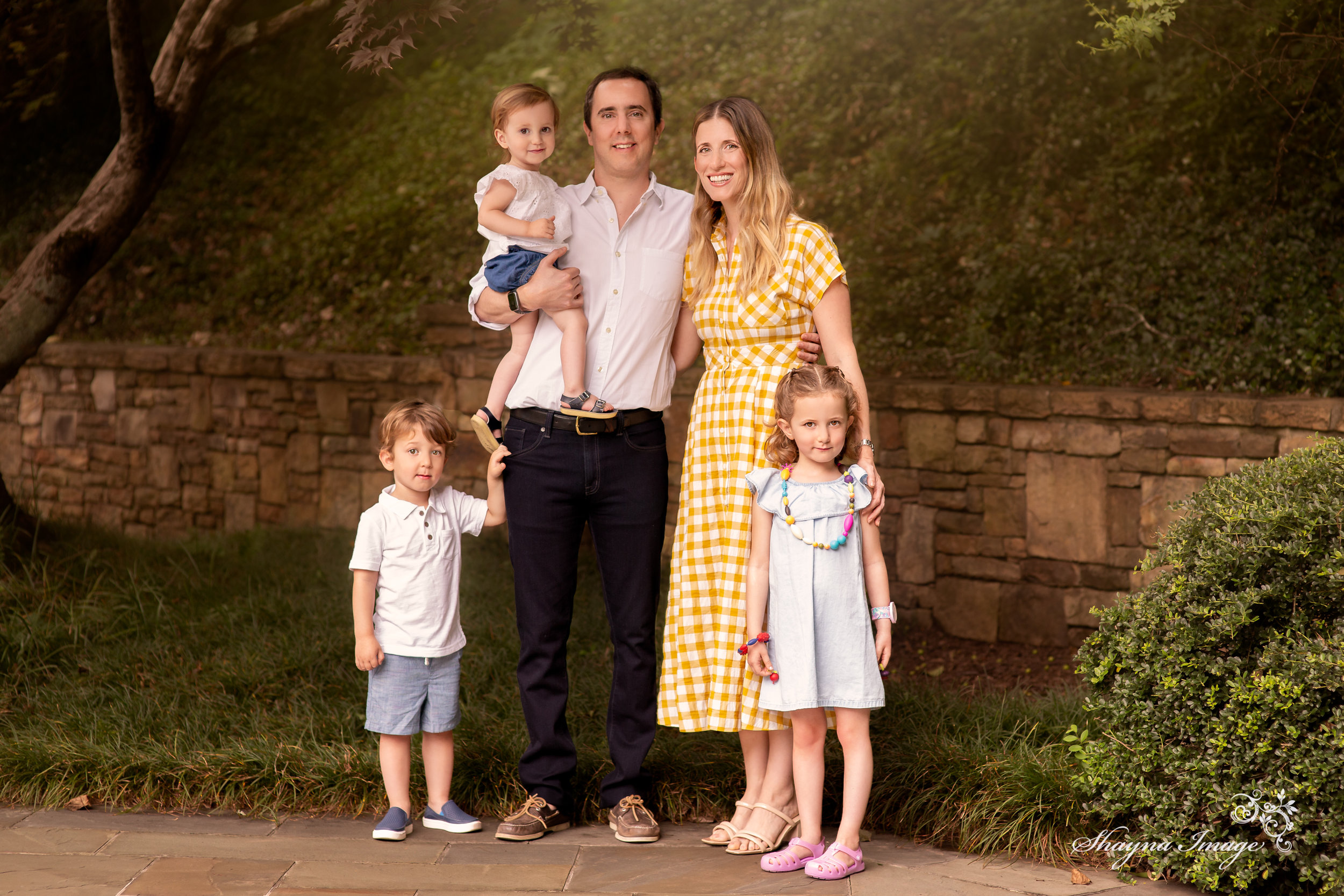
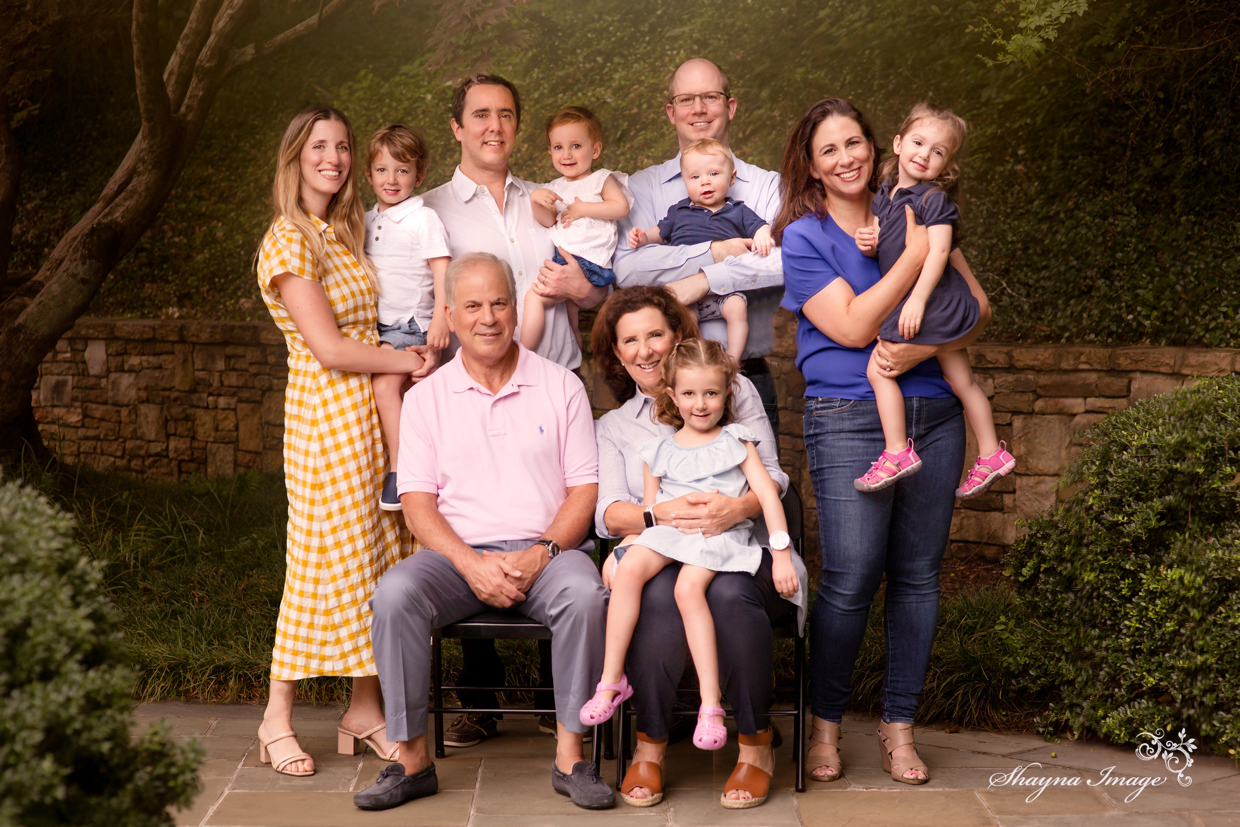
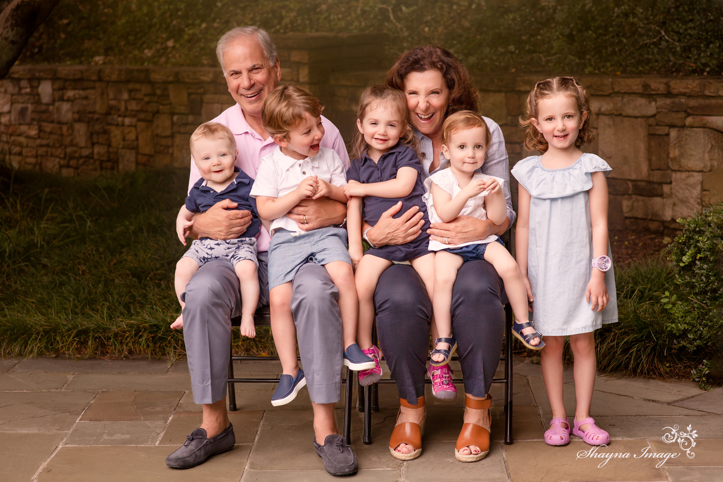
“My sister and her family are visiting us and our parents from Argentina! Let’s have a photography session, so that we can each hang a piece of art of all of us together in our homes! But… with five grandchildren, how are you going to get everyone smiling??”

Honestly? I’m not.

But if you are going to admire a piece of art every day in your home, and pass it down, it should show every single person at their best. That’s why each piece is a carefully constructed custom art piece. Before, and after:

Can you count the changes? Comment below!

These were some of the sweetest kids. Sam’s smile pushed me over the edge. But you know the drill: out of routine, something chaotic and exciting and new, kids feel and show every moment of it. That’s why it’s my job to show the BEST of each precious human.

Soon, these will look like this on their walls!

(Unedited images in gallery designs)

(Unedited images in gallery designs)

House a Home

We moved! One by one, we’re tearing through the boxes, putting things in their new spot, and figuring out what has yet to be found. Settling in. For me, what transitions my new house into my new home is putting the family art up on the walls. So while I have much more to go, tonight we decided to begin to make our mark on our space.

These are images printed on matte standout metals, and assembled from two different family sessions.

The perfect wall.

The perfect wall.

Centered and designed.

Centered and designed.

TA-DA!

Just a hundred pictures left to go!
Another step closer. The transformation is incredible.

A peek into a consult...

Yesterday’s pre-shoot consultation was AMAZING!! Want to know what happens at one of these?

We had spoken on the phone so that I could learn about the client, her goals, and then review her options and pricing. Then we scheduled for me to come over.

I showed her all the goodies. She was interested in glossy metals, but wondered if I could produce something that would flow with another gallery she already had.

Oh, you mean a wood-mounted print? Like this?

Screen Shot 2019-06-14 at 11.09.14 AM.png
Screen Shot 2019-06-14 at 11.21.34 AM.png

No problem.

We discussed the image combinations she desired: one with the whole extended family, individual families, grandparents with grandkids, and individual kids.

She showed me what they plan to wear, and it’s PERFECT. The color scheme of blue, white, and black will be phenomenal in her space! The girls’ dresses poof and move and show light and I can’t wait!!

Then I took pictures of her walls where she wanted prints, and measurements. That way, once we finish her shoot, she can see on my computer exactly what her images will look like in her home, on her walls!

I swiped her cc for retainer, and then packed up. But of course, we really hit it off. So we talked. Because one of the best things about my job is the new friends that come along with it!

What to Wear Part 3

Two Fridays ago, I mentioned that I like thinking about styling a client in one of three categories:

  1. Classically breathtaking

  2. True to you

  3. Designer’s dream

In Designer’s Dream, your focus is on your finished product and how it interacts with your space. Is your style modern? minimalist? shabby chic? nautical? Do you have prominent colors that echo through your space? Do you want a piece of art that not only features your family, but compliments you home style?

You are looking for fabrics with movement and texture. Everyone doesn’t need to precisely match one another nor your room, but should be in complimentary color groups. When we design your shoot, I can guide you into the color group that is flattering both to you AND your room!

What to Wear Part 2

Last Friday, I mentioned that I like thinking about styling a client in one of three categories:

  1. Classically breathtaking

  2. True to you

  3. Designer’s dream

Today, let’s think about #2: True to you. While Classically Breathtaking evoked emotion in the way of timeless artwork, True to You is painting a picture of who you all are, right now. You want your personalities to shine. Bold fabrics, colors, and textures that are just a step up from what you wear every day. Stay away from logos or graphics that will draw attention away from you and your energy. Think about color groupings, rather than precisely matching. Shades of blues, greens, oranges, but variations on the theme.

Click the image above for the pinterest inspiration board. Next Friday is Part 3 of What to Wear!

What to Wear Part 1

As I see it, there are three different directions you can go in when styling your shoot:

  1. Classically breathtaking

  2. True to you

  3. Designer’s dream

Today, we’ll look at #1, Classically breathtaking. You are the art. Clothes fit the following criteria:

  • Fabric that moves.

  • Neutral colors like white, creams, beiges. Avoid patterns.

  • Timeless pieces.

If you are pursuing this look, avoid jeans, which will always communicate the current era. We are going for breezy and classic.

Click above to open Pinterest board for inspiration. Special shout out to Eliana Naomi whose gorgeously curated boards helped launch my search.

Check back next Friday for Part 2: True to You!